As a pediatric cancer survivor, I have a personal passion for raising awareness and funding for the cause. Before the recent federal cuts, only 4% of federal cancer funding went towards pediatric research. That number is now even lower, targeting one of the most vulnerable populations who struggle to advocate for themselves.
While the battle is uphill, these projects are my small contribution in the fight against cancer.
Cancer Design Series I
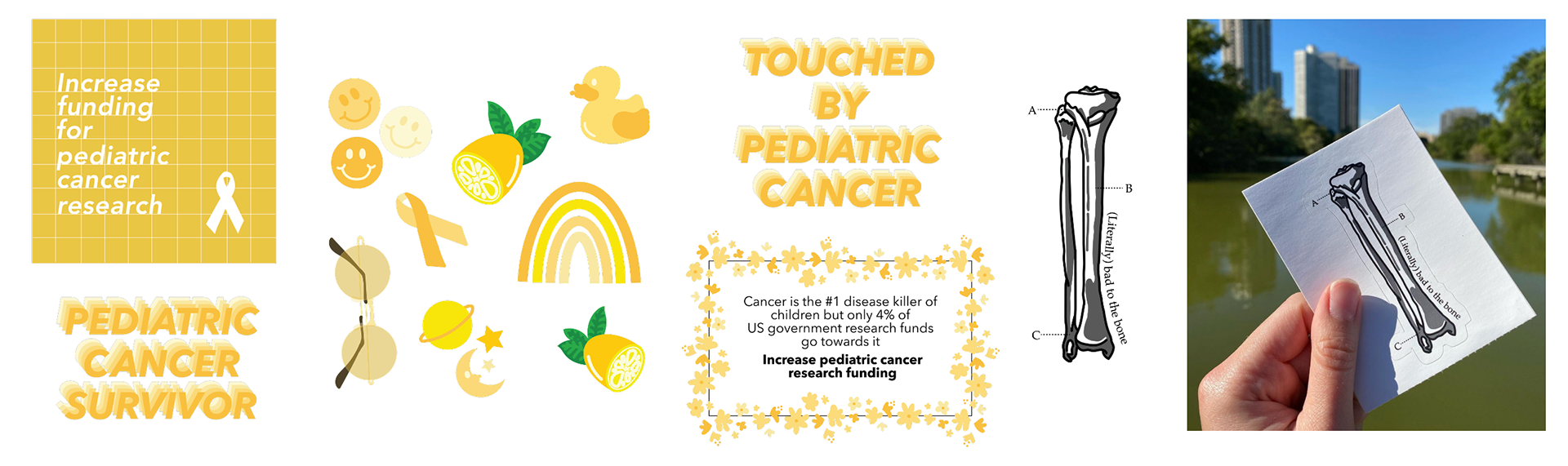
CHALLENGE: September is Pediatric Cancer Awareness month. As a pediatric cancer survivor, I wanted to purchase something cancer-themed I could wear that would donate to cancer research or treatment. However, after searching the market, I couldn’t find anything attractive I’d want to rep.
SOLUTION: Create my own line of stickers, sold on RedBubble. I chose stickers as they have a broader appeal than clothing and can be displayed in a variety of ways. The collection follows a yellow theme, which is the color of the pediatric cancer ribbon. I created a selection to fit a range of audiences, including targeted stickers for survivors like myself and a more subtle yellow collection for general supporters. Messaging focused on the lack of federal funding for cancer research and, as nod to my own journey, a ”Bad to the Bone” sticker given my battle with bone cancer.
RESULTS: I sold nearly 300 stickers that month across 13 states, donating all proceeds to pediatric cancer research at RUSH University Medical Center in Chicago, where I was treated.
CANCER DESIGN SERIES II
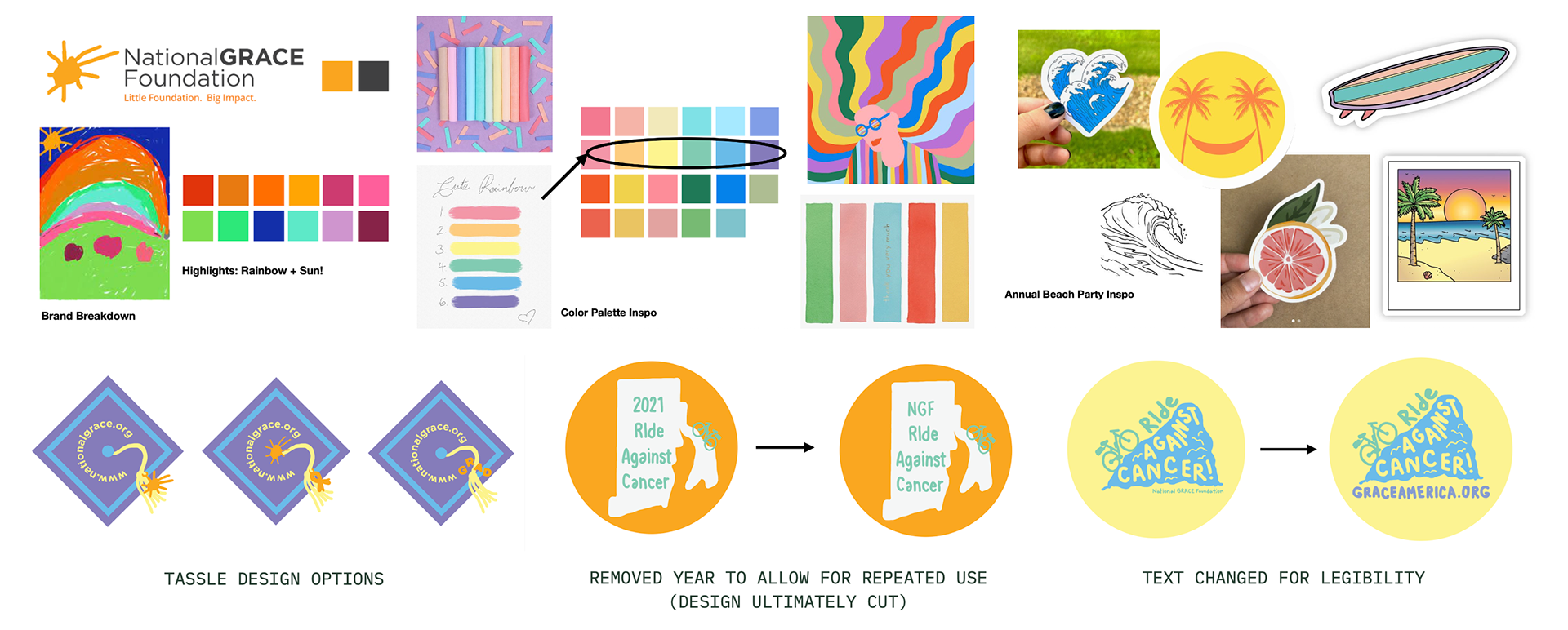
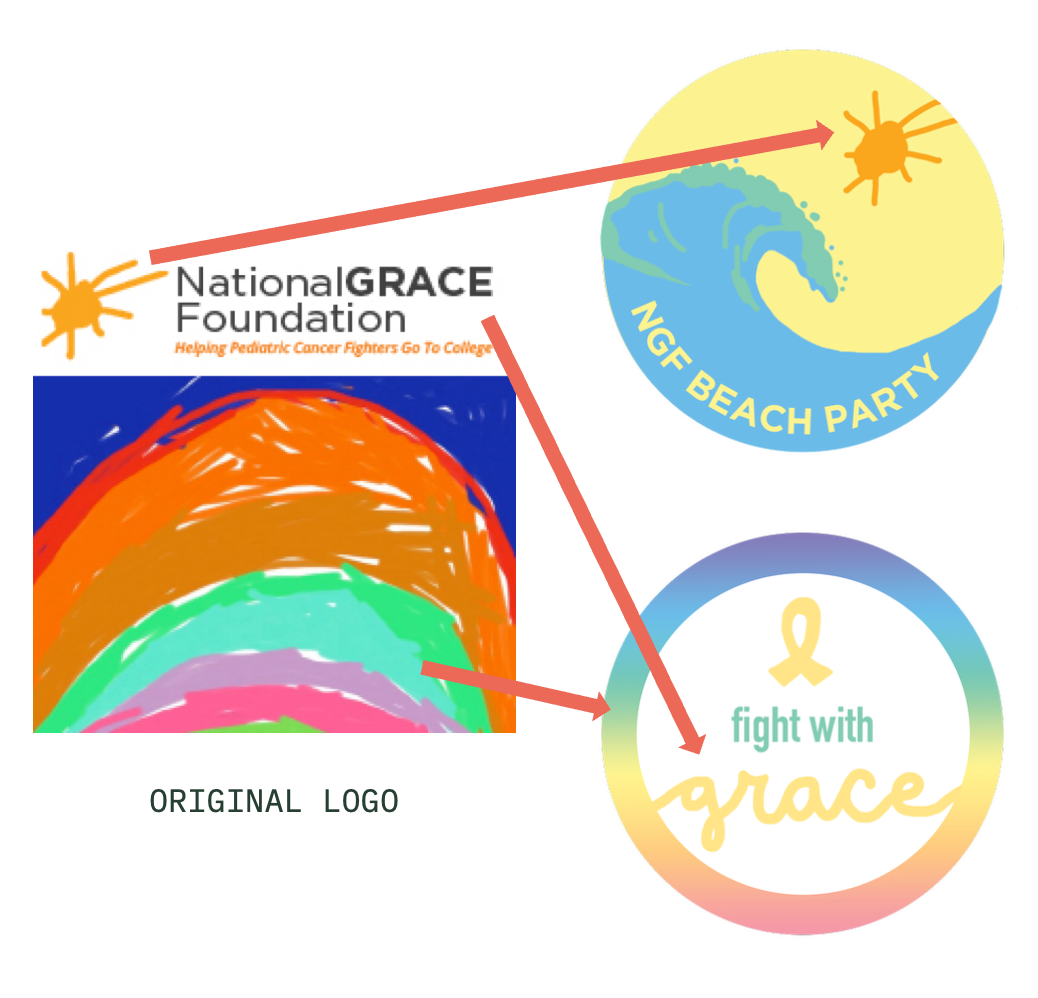
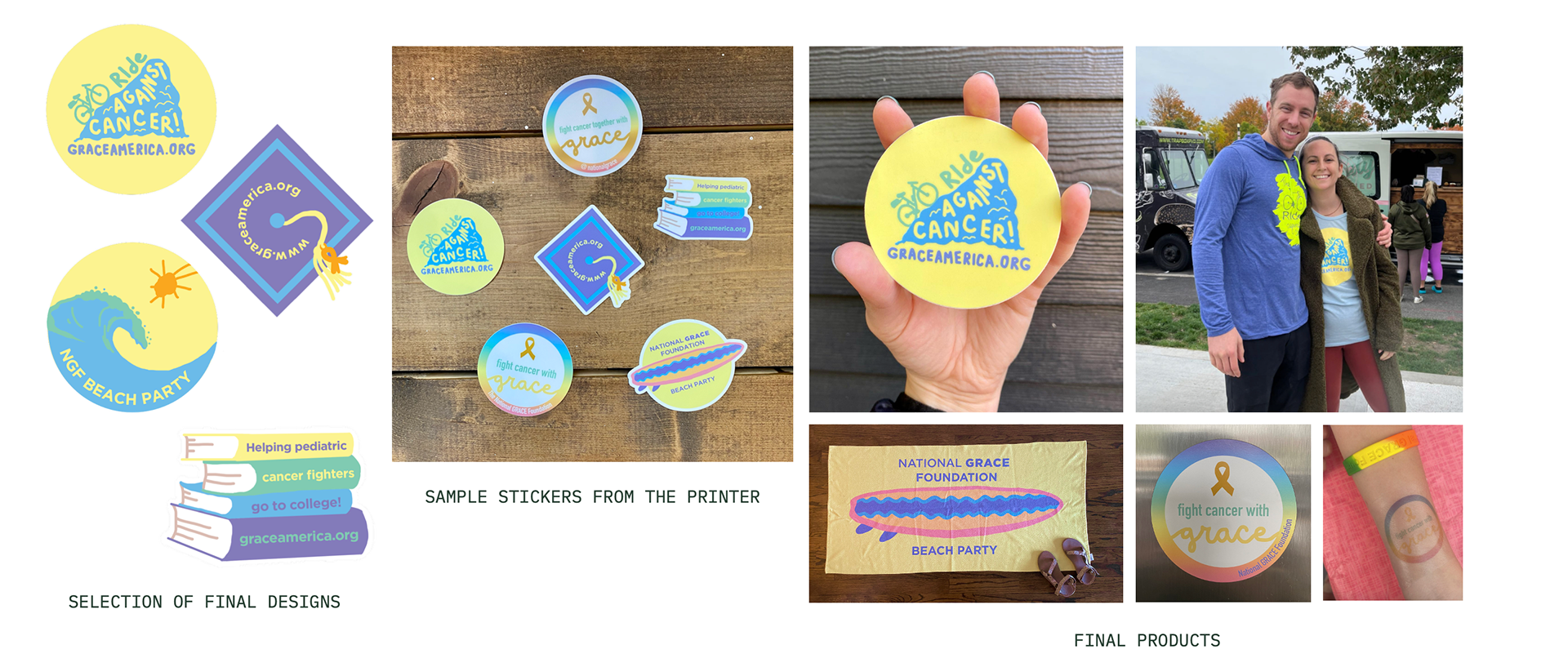
CHALLENGE: The National Grace Foundation, a Rhode Island nonprofit that provides free college admission and financial aid assistance to young cancer fighters, saw my stickers and requested their own set of designs. New challenges included:
- Honor the foundation’s logo, drawn by the namesake child who battled cancer, but elevating it
- Creating a series of designs for upcoming events, like the annual beach party and bicycle race, and designs that would support the organization’s everyday mission
- Working directly with the founder for input and reviews
SOLUTION: Reinterpret the original rainbow design to be more complimentary, while maintaining the bright, cheerful tone. The hand drawn sun and use of the foundation’s name “Grace” were also incorporated into select designs. Given the scale of the stickers, text was kept to a minimum and visual designs were used to emphasize the topic.
RESULTS: The National Grace Foundation loved the designs. In addition to printing stickers, they also printed magnets, t-shirts, temporary tattoos and towels. The swag and designs remain a part of their events and digital communication three years later.